Patterns, Art Deco & Funny Podcasts
Where do you tend to get your initial design inspiration from?
My inspirations are quite eclectic, but if you look through my bookshelves and Pinterest boards it’s almost entirely 20th Century textiles, illustration and printmaking, particularly from the 1920s-1950s. I might see a 1930s Japanese matchbox label in a book, and it sparks an idea for a card design. In fact, it was our shared love of Japanese matchbox labels that brought us together...
Once you have an initial idea, what is your process of turning that into a fully-fledged design?
I’ll start with pencil sketches and when I’m happy with the composition I’ll use a lightbox to draw over that in black ink. I’m always thinking ahead to the printmaking process, so draw each ‘colour’ in black on separate layers so they can be easily prepared for letterpress, litho or screen print. Then I scan these in and bring the design together in Adobe Illustrator - this is where you can play with colour and composition until it’s ready to go to press.
Can you talk us through some of the big influences of your artistic style?
I am in love with all things Art Deco and 1930s Modernism, although my own style is a bit more 1950s because I can’t resist those bright colours. Certain graphic designers from the interwar years, especially Edward McKnight Kauffer and Ashley Havinden, inspire me in their use of a limited colour palette and playful, striking imagery. And lots of women textile designers from that time inspire me, like Marion Dorn and Ruth Reeves. I have a Design History blog where I write about some of these lesser-known designers and studios.
How do you go about choosing the colours and patterns you want to incorporate into each design?
Choosing colours takes me ages as there are so many wonderful possibilities. I have a palette of about 12 colours that I use over and over, which are a mix of vibrant and muted. I love what textile designer Dorothy Liebes used to say - that for each design you should use ‘a dark, a light and a bright’ for a harmonious balance.
When you are sitting down to design something, everyone has their own routine, do you like to work with pen and paper first? Or do you do everything digitally? Do you like to listen to music?
Recently I’ve started using an iPad to draw, which is great as it’s quicker and easier to edit, but paper and ink will always be my preference. Either music or podcasts will be playing in my ears - I only listen to funny podcasts that make me laugh, nothing too serious
How did you know that you wanted to be a pattern designer and printmaker? Where did the love of the craft stem from?
Although I studied interdisciplinary design at university, it wasn’t until I did a MA in Design History that I fell in love with patterns. I wrote my thesis on 1930s furnishing fabrics and felt such a thrill riffling through textile sample books in different museum archives. I never thought of myself as an illustrator, but my love of 20th century illustration and printmaking spurred me on to develop my own drawing style.
We are launching your new tissue paper designs; can you talk us through your inspiration for these specifically?
Yes, it’s been a lovely project. The Strawberry design was inspired by a cheerful 1930s curtain fabric by Morton Sundour that I found in a swatchbook deep in the Museum of the Home collections, which the Archivist creative team also loved. That’s where the wavy diamond shape came from. We also used as inspiration a charming old matchbox label illustrated with a lighthouse; I tried to retain the textures of the original printing method.
Did you face any challenges when creating these tissue paper designs?
The patterns with a wavy diamond composition were surprisingly tricky - getting that to repeat seamlessly was a head-scratcher, but I enjoy a challenge when it comes to repeats. And the detailed texture on the Lighthouse pattern was so complex that my computer almost ground to a halt!
And if you had to pick just one, which of these tissue paper designs would you say is your favourite?
I particularly love the Strawberry pattern - it's so cheerful. I have always loved the fabric it was originally inspired by, so it feels like a little homage to it.
 Strawberry Tissue Paper
 Lighthouse Tissue Paper
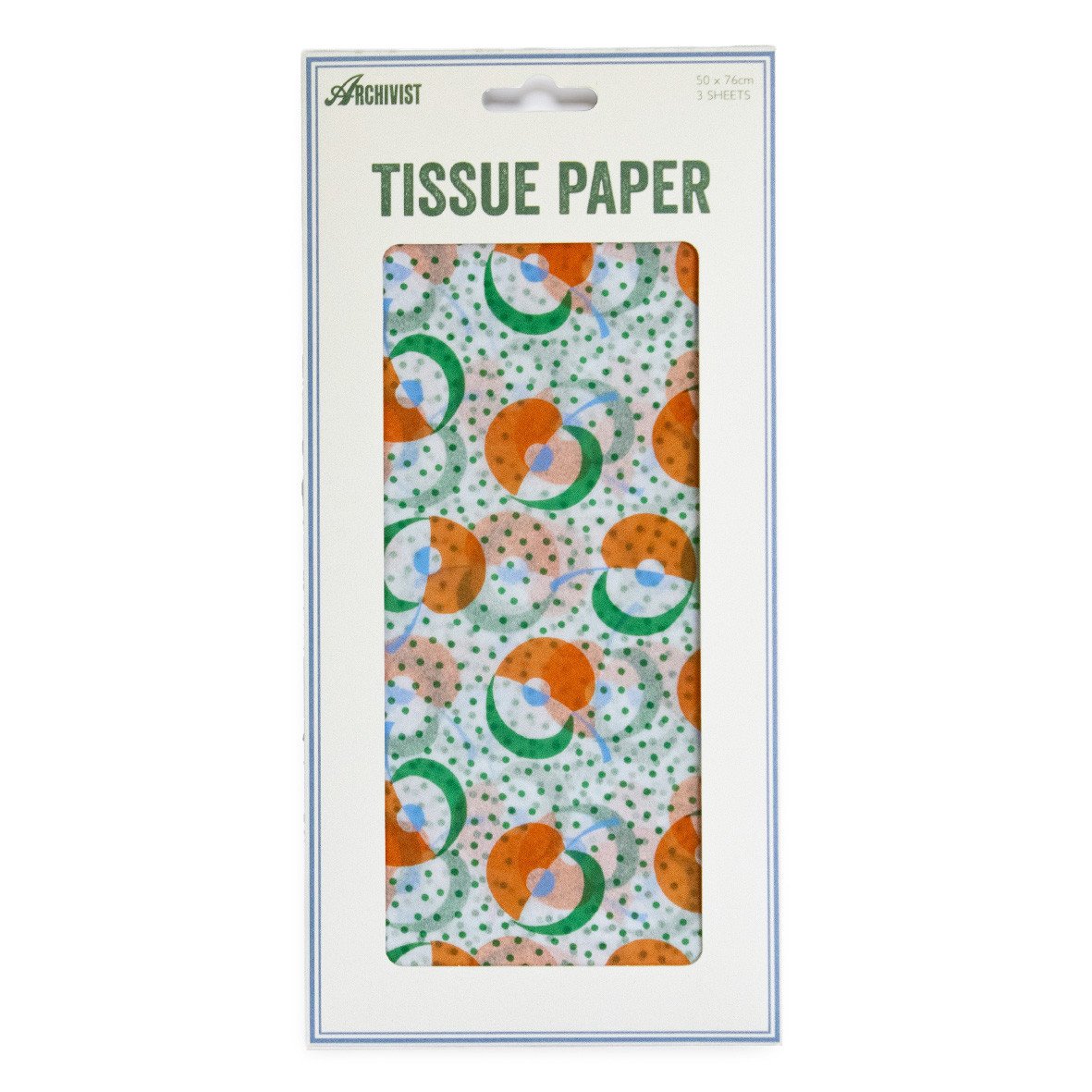 Apple Picking Tissue Paper


